Education Library
RSI Booking Widget – Custom Styles
Main Custom CSS
The OS3 widget can be customized using CSS directly from your website. The below code is commonly used for all widget types: main, location, provider, and procedure.
Update the primary color --rsi-os3-primary to match the design of your website.
	/*=========================================
	  GLOBAL VARIABLES
	========================================= */
	:root {
		--rsi-os3-primary: #e02b21;
	}

	/* =========================================
	STYLES
	========================================= */

	.rsi-landing-options-container {
		margin-top: 20px !important;
	}

	.rsi-landing-option {
		border: 3px solid var(--rsi-os3-primary) !important;
		color: var(--rsi-os3-primary) !important;
		border-radius: 20px !important;
	}

	.rsi-online-scheduling a,
	.rsi-online-scheduling .action-text {
		color: var(--rsi-os3-primary) !important;
	}

	.rsi-online-scheduling {
		padding-top: 50px !important;
	}

	.rsi-form-control,
	.providers-container {
		box-shadow: 0px 0px 3px 0px rgba(0, 0, 0, .10) !important;
		padding: 20px !important;
		padding-bottom: 0 !important;
		border-radius: 20px !important;
		border: 1px solid #d0d0d0 !important;
	}

	.providers-container {
		padding-bottom: 20px !important;
	}

	.scheduling-popup-body .rsi-form-control,
	.scheduling-popup-body .providers-container {
		box-shadow: unset !important;
		padding: unset !important;
		padding-bottom: unset !important;
		border-radius: unset !important;
		border: unset !important;
	}

	.location-form {
		margin: 10px 0 !important;
	}

	.rsi-slot {
		background: var(--rsi-os3-primary) !important;
		color: white !important;
		margin: 10px 0px !important;
	}

	.rsi-location-container {
		background: var(--rsi-os3-primary) !important;
		padding: 10px 20px !important;
		color: white !important;
		border-radius: 20px !important;
	}

	.loader-wrapper {
		background: #ffffff7d !important;
	}

	.provider-container {
		margin-bottom: 20px !important;
	}

	.next-date-info {
		background: #e7e7e7 !important;
		padding: 10px !important;
		margin-top: 10px !important;
		border-radius: 20px !important;
	}

	.rsi-provider-avatar .ng-star-inserted {
		border: 1px solid #ebebeb !important;
		margin-right: 20px !important;
		display: none !important;
	}

	.scheduling-popup-body .rsi-provider-avatar .ng-star-inserted {
		border: unset !important;
		margin-right: unset !important;
	}

	/* os3-home */
		.os3-home .rsi-landing-options-container {
		flex-direction: row !important;
	}
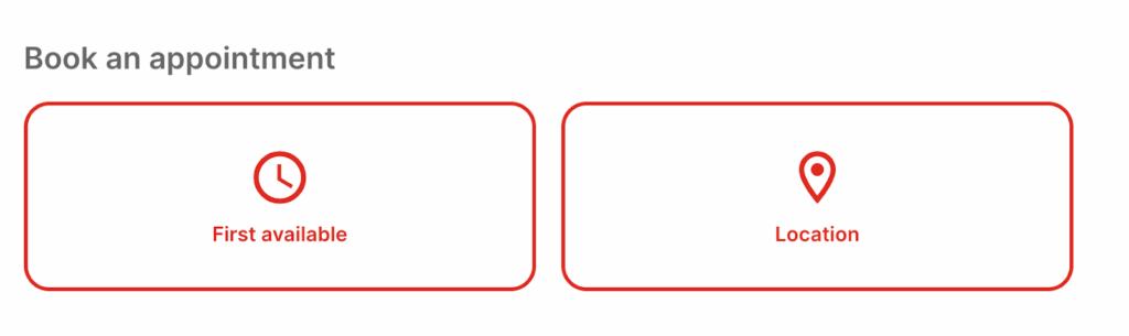
Home View
Disabling Buttons
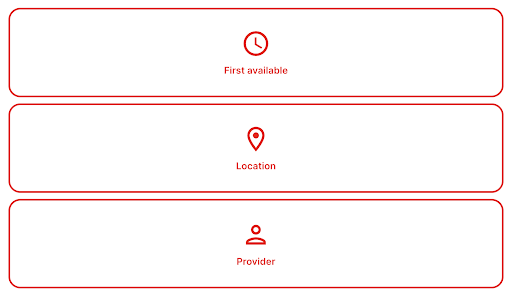
By default, the main widget will display: First Available, Location, and Provider. You can hide some of these buttons. The example below hides the provider:
	.rsi-landing-options-container .rsi-landing-option:last-child {
		display: none !important;
	}
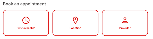
Aligning Buttons Horizontally
By default, the buttons are aligned vertically in tight spaces:
But this can be forced to save space::
	/* os3-home */
	.os3-home .rsi-landing-options-container {
		flex-direction: row !important;
	}
Bio Pictures
When no bio picture is assigned to a provider, this will show as blank leaving space. You can either add a border and/or a specific background:
Adding a Border
	.rsi-provider-avatar .ng-star-inserted {
		border: 1px solid #ebebeb !important;
		margin-right: 20px !important;
	}
Removing Bio Picture
	.rsi-provider-avatar .ng-star-inserted {
		display: none !important;
	}

Other Custom Styling Options
Since the widget is customizable via CSS, you can freely adjust the look and feel of all widget elements.